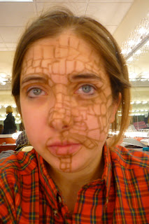
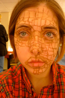
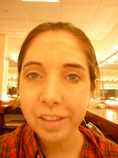
The mosaic was very frustrating for me because it was so precise. It was difficult to tell exactly where the lines would go because it was a recreation of a piece of art rather than something that naturally happens to the face. When I started out it helped to keep my finger in place to tell exactly where I was at on the drawn mosaic. I really like the way it turned out though. I think the color choices were fairly accurate from the painting as well. I hated my eyebrows though. They were accurate but they just looked big and bushy.
Sunday, October 31, 2010
Sunday, October 24, 2010
full face aging
preparation
adding highlights
I like this expression a lot for some reason.
What I found most difficult with the aging was making the wrinkles look real. I found you had to put shadow under the bone structure to really make the wrinkles look authentic. Also I found I had to go back in and add pencil to the shadows to make them stand out more.
Thursday, October 21, 2010
aging drawing
Doing the aging was interesting to me. At first it looked like the lines would be fairly straight but after I traced the portrait of the old lady I noticed that the lines were very uneven and curved. I also learned that the more subtle the lines were the more realistic it looks. Even with a deep indentation like around the eyes it looked more realistic if it was subtle. You can kind of see that with my eyes. The left eye is more subtle and realistic looking while the right eye has a darker line which just looks like a circle around my eye. I also learned that the lips become a lot more puckered and have a lot of lines on them.
Tuesday, October 19, 2010
Fat/ Skinny Makeup
fat side- I like the way this turned out
The skinny side looks very similar to the fat side
the line near the nose helps make it look skinnier
eww double chin. gross
Subscribe to:
Comments (Atom)


